Brand
Guidelines
Wenix 2026
Wenix
Wenix is a creative technology studio. We make the marketing, content, and campaigns brands actually need — designed by people, sharpened by the best tools available. From strategy to execution, we build the systems that turn ideas into measurable growth, without the guesswork or the wait.
Mission
To give businesses an unfair advantage — pairing real creative judgment with automation that does the heavy lifting. The taste, the direction, the final call stay human. The speed comes from everything working behind the scenes. Marketing, development, and production that's faster and sharper, and still looks like someone cared.
Vision
To become the go-to creative and production partner for ambitious brands — proving that smart systems and great craft aren't opposites. A future where the work that used to take a big team and a bigger budget is within reach of every business, not just the biggest.


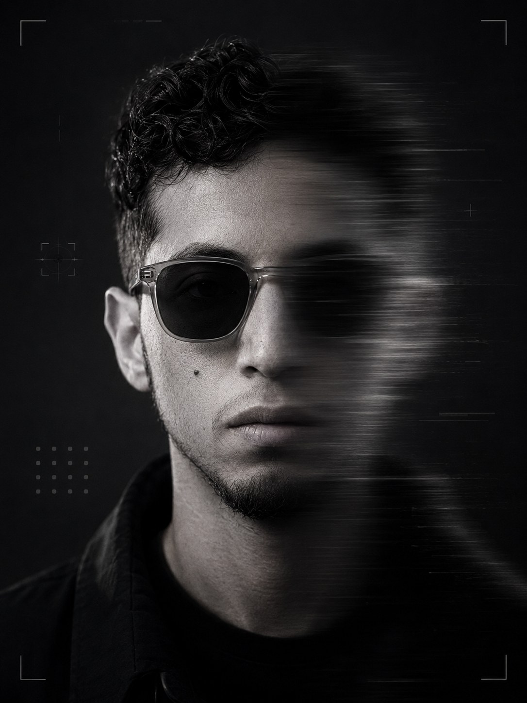
Marketing today isn't about doing more — it's about moving faster and smarter. Wenix pairs human creativity with AI systems so your brand does both.
Strategy meets speed — that's how brands grow now.
Ideas from humans.
Growth from machines.

Construction grid
The Wenix logo is built on a precise unit grid. Use this construction as the only guide when recreating the logo. All proportions are based on a single unit (X).
6X
12X
19X total logo width · 4X symbol height · 3X wordmark cap height
1. Unit grid
The logo is constructed on a grid of equal units (X). All measurements are based on this unit.
2. Symbol
The symbol is 4X tall and 6X wide. Its diagonal is set at a 45° angle.
3. Gap
The clear space between the symbol and wordmark is 1X.
4. Wordmark
The wordmark cap height is 3X. The wordmark is 12X wide.
5. Alignment
The top of the symbol aligns with the top of the wordmark cap height. The bottom aligns with the baseline.
Clear space
Clear space is the area surrounding the wordmark and the Wenix mark that must be kept free of other graphic elements.
For the horizontal logo orientation, maintain a clear space equal to the width of the mark. For the vertical orientation, maintain a clear space equal to the width of one of the shapes within the mark.

x = height of the letter “X”
Minimum size
Establishing a minimum size ensures that the impact and legibility of the logo is not compromised in application.
Logo lockup
70px (digital)
20mm (print)
Logo symbol
21px (digital)
6mm (print)
Horizontal lockup
The Wenix logo pairs the wordmark with the icon in a single horizontal lockup. This is the primary configuration — use it as the default wherever space allows. It carries the full brand in one clean read, and it should be your first choice in any first-touch or unfamiliar setting where the name needs to land.
Icon alone
The icon may also stand on its own — as an app icon, favicon, social avatar, or graphic accent — but only where the brand is already established and audiences will recognize it. When the icon appears in a first-touch or unfamiliar context, pair it with the wordmark so Wenix reads clearly without extra explanation.
Logo misuse
It is important that the appearance of the logo remains consistent. The logo should not be misinterpreted, modified, or added to. No attempt should be made to alter the logo in any way. Its orientation, colour, and composition should remain as indicated in this document — there are no exceptions.
No
Do not use the old stacked version of the logo.
No
Do not rotate the logo.
No
Do not distort or warp the logo.
No
Do not apply a gradient to the icon or wordmark.
No
Do not change the logo colour or tone outside of approved green and black.
Wenix
No
Do not change the typeface.
WENIXTechnologiesNo
Do not use the wordmark or add any extra elements.
Applications
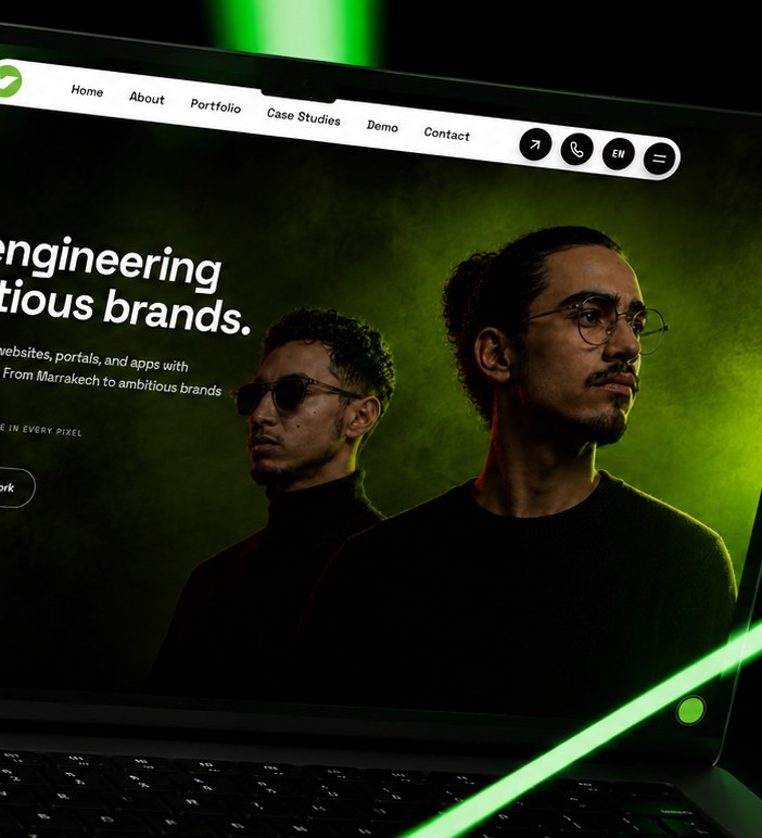
Website
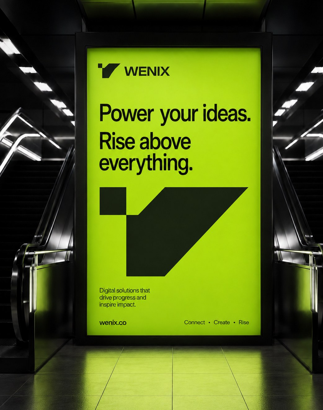
Poster / OOH
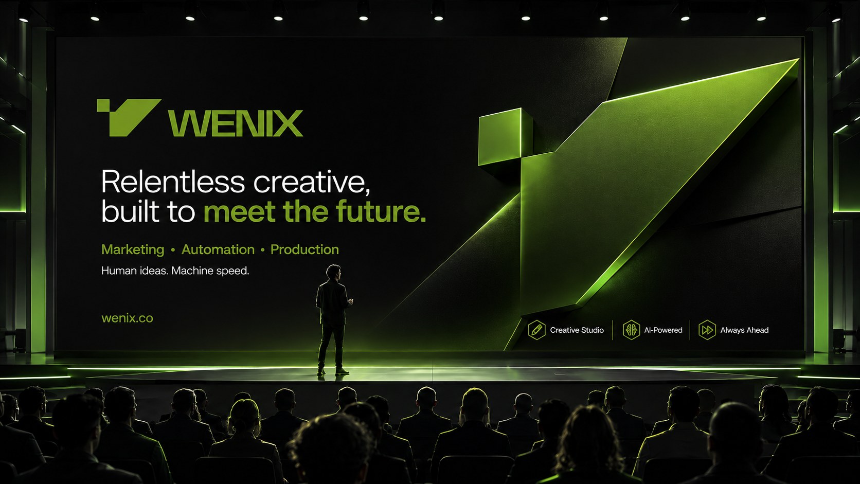
Keynote stage
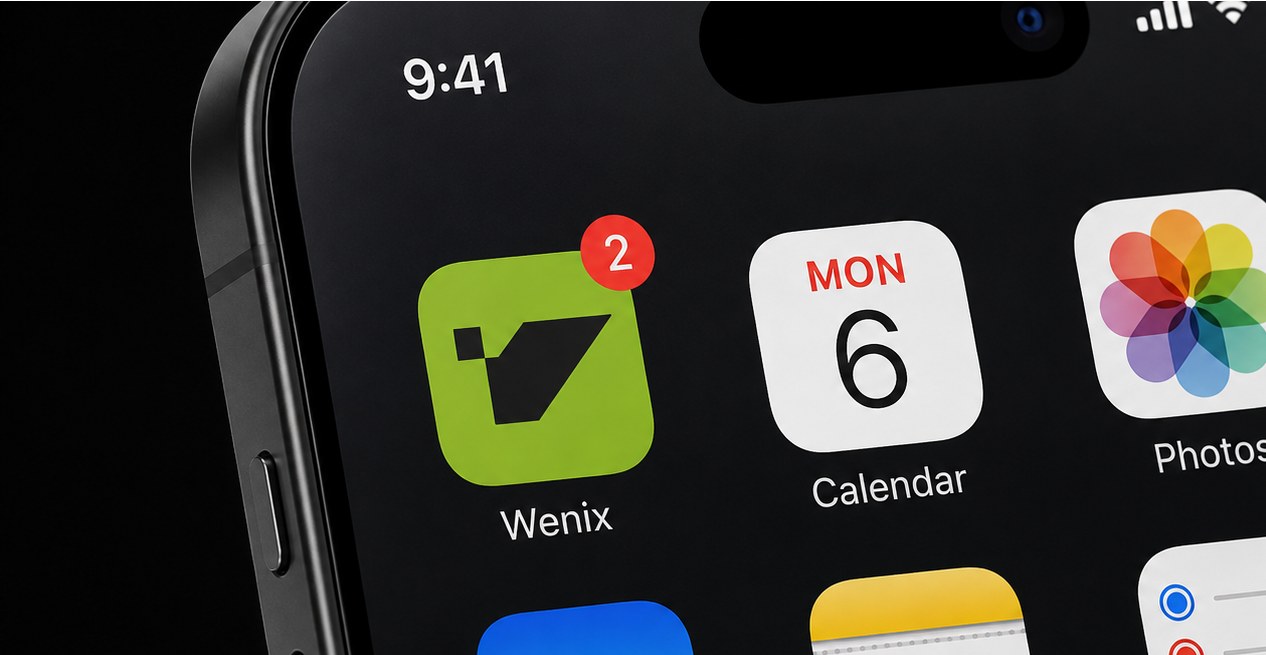
App icon
Tone of voice
The five traits — how we sound.
01 Visionary
Speak in futures, not features. Lead with the world we're building — the Ascend.
02 Confident
Take a position. No hedging. Say it plainly, and once.
03 Provocative
Challenge the default — but always to serve the idea, never for edge's sake.
04 Crafted
Every word earns its frame. Short, deliberate, cinematic. One strong verb beats three weak ones.
05 Human
'We' and 'you,' contractions, real talk. Bold, never cold. A real studio behind the work.
Do
- Short, declarative sentences. Fragments for impact.
- Active voice, strong verbs — render, build, move, ship, ascend.
- Lead with the idea or outcome, not the deliverable.
- Make one bold claim, then prove it.
Don't
- Corporate filler — "solutions provider," "leverage synergies."
- Hedging — "we try," "hopefully," "sort of."
- Over-explaining. Trust the reader.
- Exclamation spam, or emoji in brand copy.
Everyone's still describing the future.
We already rendered it.
We are / we're not
Bold enough to say it. Sharp enough to back it. Cinematic in the look, exact in the build. We move fast and finish clean.
Every strength sits one step from its own failure. Bold slips into loud. Confidence hardens into arrogance. Vision blurs into vague. Walking that line is the whole craft — and staying on the right side of it is what sounds like us.
Loud is not bold. Arrogant is not confident. Buzzwords are not vision. The second we cross over, we stop being Wenix.
Our vernacular
Our words carry movement and craft: build, render, ship, ascend, world. Verbs you can point at. Things we actually make.
The words we bury are the ones every agency hides behind — solutions, synergy, leverage, disrupt, full-service. If a line could sit on a competitor's site without changing a single meaning, it was never ours.
RGB: 114, 154, 46
CMYK: 26, 0, 70, 40
Primary Green
HEX: #729A2E
RGB: 86, 108, 32
CMYK: 20, 0, 70, 58
Dark Olive
HEX: #566C20
RGB: 242, 255, 210
CMYK: 5, 0, 18, 0
Pale Tint
HEX: #F2FFD2
RGB: 40, 44, 30
CMYK: 9, 0, 32, 83
Near-Black
HEX: #282C1E
RGB: 255, 255, 255
CMYK: 0, 0, 0, 0
White
HEX: #FFFFFF
Digital extension
Used across this site for accents and dark grounds — not swatched for print.
Lime
#8FBF1F · Digital accent for dark grounds & CTAs
Ink Deep
#0F1109 · Darker ground for full-bleed sections
Typography
Typography for titles
Styles — Sans Serif
Space Grotesk
Space Grotesk embodies our design principles of simplicity, minimalism, and structural clarity. Its geometric forms and subtle technical character echo the hard angles of the Wenix mark, giving the brand a modern, engineered voice.
Typography for logo
Styles — Sans Serif
Space Grotesk
We use Space Grotesk for the wordmark for its commanding presence and technical precision without sterility. The brand identity requires communication that's both visually rigorous and instantly accessible — legible to audiences who need to understand the core message quickly.
Light
Aa Bb Cc Dd Ee Ff Gg Hh Ii Jj Ll Mm Nn Oo Pp Qq
Rr Ss Tt Uu Vv Ww Xx Yy
0123456789 & @ # % ( ) . , ! ?
Regular
Aa Bb Cc Dd Ee Ff Gg Hh Ii Jj Ll Mm Nn Oo Pp Qq
Rr Ss Tt Uu Vv Ww Xx Yy
0123456789 & @ # % ( ) . , ! ?
Medium
Aa Bb Cc Dd Ee Ff Gg Hh Ii Jj Ll Mm Nn Oo Pp Qq
Rr Ss Tt Uu Vv Ww Xx Yy
0123456789 & @ # % ( ) . , ! ?
Bold
Aa Bb Cc Dd Ee Ff Gg Hh Ii Jj Ll Mm Nn Oo Pp Qq
Rr Ss Tt Uu Vv Ww Xx Yy
0123456789 & @ # % ( ) . , ! ?
Imagery
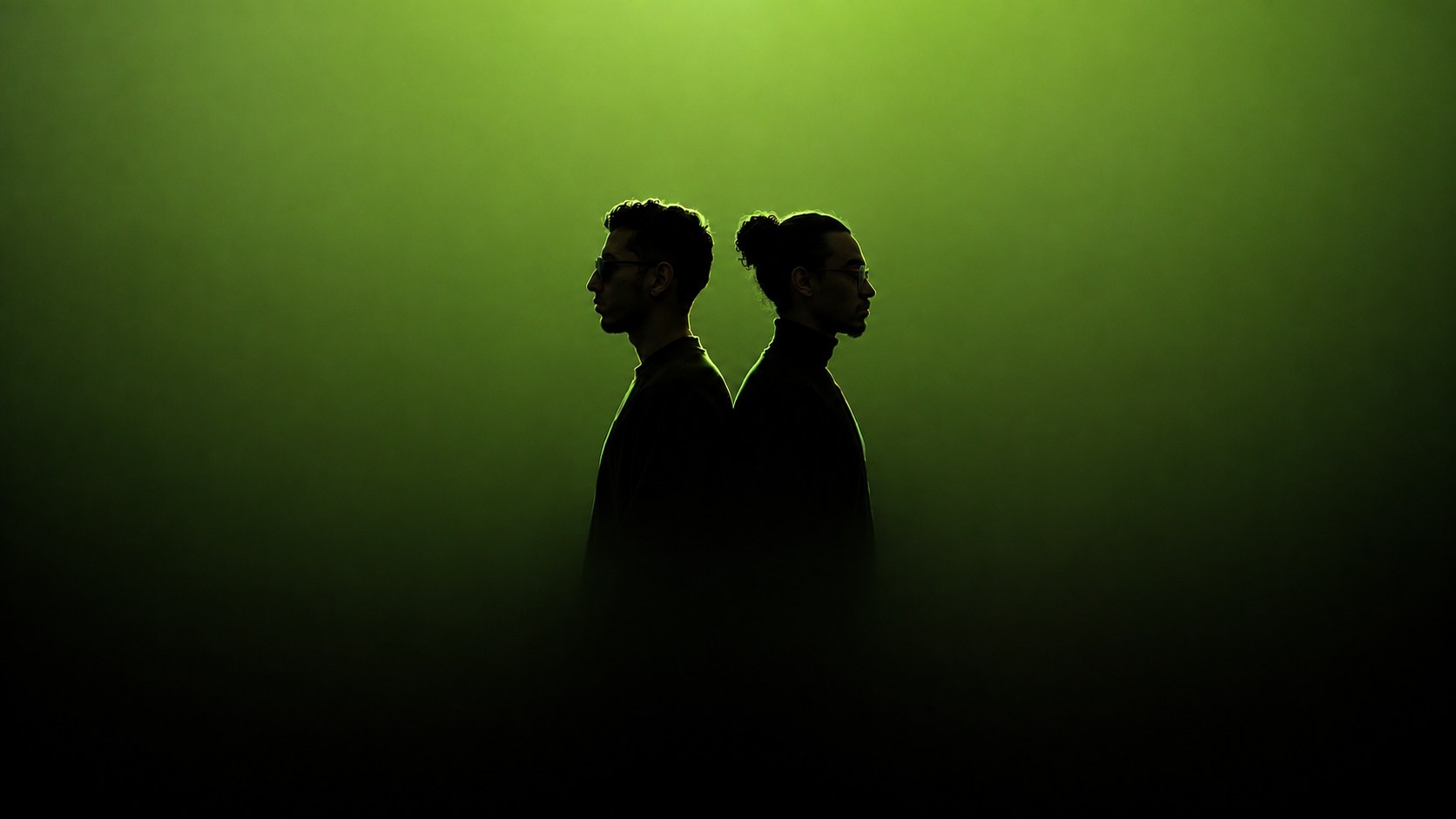
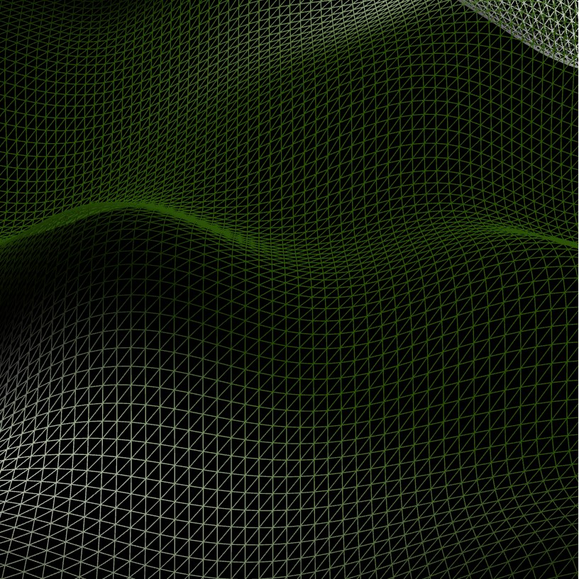
Full-bleed photography with green rim-lighting and smoke, or dark 3D angular renders. Always pair overlaid text with a gradient scrim for legibility.
Hero terrain

Hero hand light
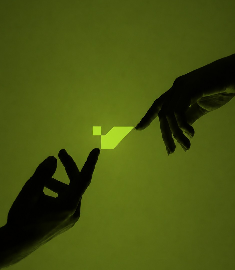
Human machine handoff

Portrait phones
Portrait cinematic
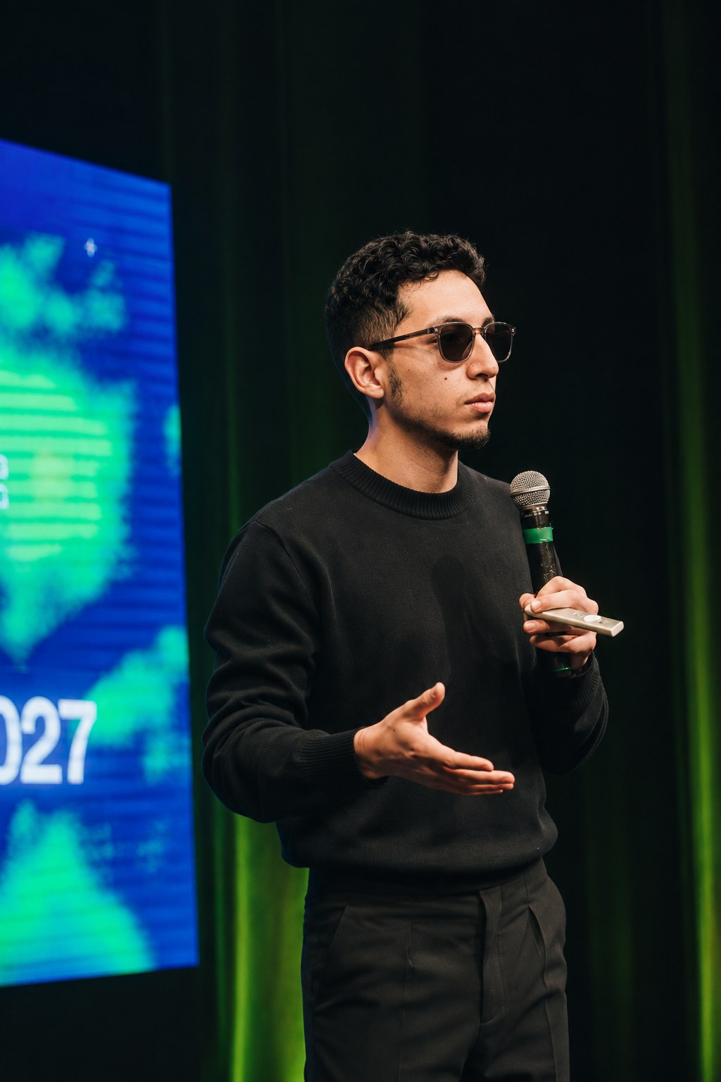
Studio in action
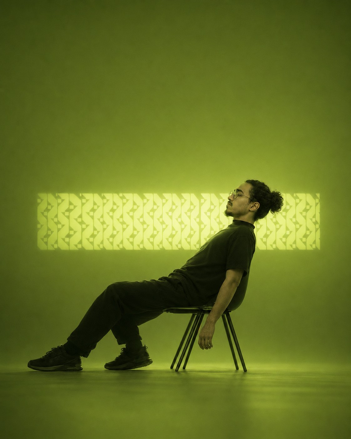
Signature chair pattern
Silhouettes green

Lifestyle phone

Gradient green black
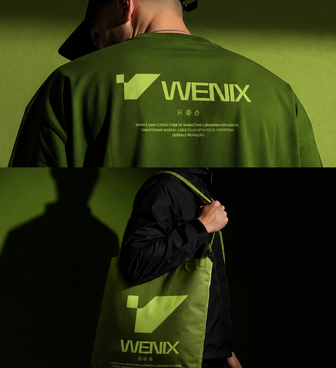
Merch apparel tote
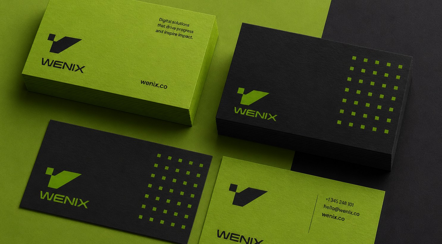
Stationery cards
Generating new imagery
Near-black scene, single subject, hard green rim-light, faint haze, negative space for type. Never use stock that breaks the dark/green grade.


Patterns
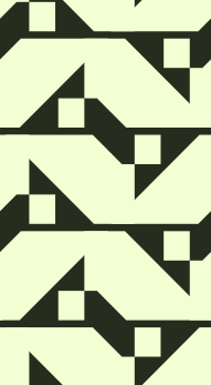
Seamless tiles built from the logo's diagonal. Use as a low-opacity texture in footers, section dividers, or behind CTAs — never at full strength behind text.
Thank
you.
Now you don't just know what Wenix looks like. You know what it sounds like.